If you’re starting out in graphic design or just trying to get better, you’re in the right place. Here’s why:
Also, if you’re looking for free graphic assets to level up your designs, check out DehraFlicks.com’s Download Section. With just one click, you can download icons, textures, and more—no login, no email, just free resources at your fingertips.
—
1. Start with a Purpose
Before opening your design software, ask: What is this design for?
Is it a logo? A social media post? A flyer for a local event?
Every design has a job to do. A poster about a sale should grab attention fast. A wedding invite should feel personal and elegant. When you know the purpose, choosing the colors, fonts, and layout becomes easier.
> Example:
If you’re making a graphic for a “Buy 1 Get 1 Free” offer, use bold fonts, large text, and bright colors to make it pop.
For more on visual branding, you can explore our post on how short videos can improve brand storytelling.
—
2. Keep It Simple
Clutter is the enemy. Use just one or two fonts, two or three colors, and keep space around your elements. It helps the viewer focus on what matters.
> Example:
Don’t put 5 different icons, 3 types of text, and a background image all in one small graphic. It will confuse the viewer.
This is one of the most basic yet powerful graphic design tips for beginners. Simplicity often looks more professional.
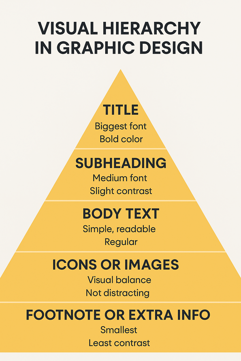
3. Understand Visual Hierarchy
Not everything in your design should be the same size or color. The most important things should be the most noticeable.
Use bigger text for titles, bold colors for important buttons or messages, and subtle tones for background details.
> Example:
In a poster about a music night, the band name and date should be more prominent than the venue details.
Learning this improves how people read and react to your designs.
4. Use the Right Tools (Even Free Ones Work)
You don’t need expensive software to start. There are lots of free graphic design software options that are great for beginners.
Here are a few:
- Inkscape – Good for vector design
All of them work well on a basic laptop. You can upgrade later once you’re more confident.
We also share tool-specific content on video editing software and workflow tips if you’re expanding into motion work.
5. Choose Colors That Go Well Together
Using random colors is one of the most common beginner mistakes. Try to use color combinations that work together and match the mood of the design.
You can explore color theory or simply use tools like Coolors.co to find matching palettes.
> Example: Blue and white feels calm and clean (good for professional content). Red and yellow feel energetic (great for food or offers).
—
6. Fonts Matter More Than You Think
Try not to use too many different fonts. Choose clear and readable ones. For headings, you can go a little bold. For body text, keep it simple.
Avoid fancy script fonts unless it’s something like a wedding card.
A good pairing is:
- Headline: Montserrat Bold
- Body: Open Sans Regular
—
Final Thoughts
These graphic design tips are not strict rules—they’re starting points. The more you practice, the better your eye gets for layout, balance, and style.
Remember:
- Keep things simple.
- Let your design “breathe”.
- Use the tools you have.
And most importantly, enjoy the process.
Whether you’re creating social media designs, using free graphic design software, or exploring new fonts and color palettes—you’re learning, and that’s what matters.
And don’t forget — at DehraFlicks.com, you can grab free graphic design assets with a single click. No signup, no email—just download and start creating.